CCMU Outreach Campaign
Creative Direction • Campaign Design • Public Outreach
While at Topograph, I served as lead designer on the development of a public outreach campaign for Tulare County’s Crisis Care Mobile Units (CCMU), a program providing mobile support for individuals experiencing behavioral health crises.
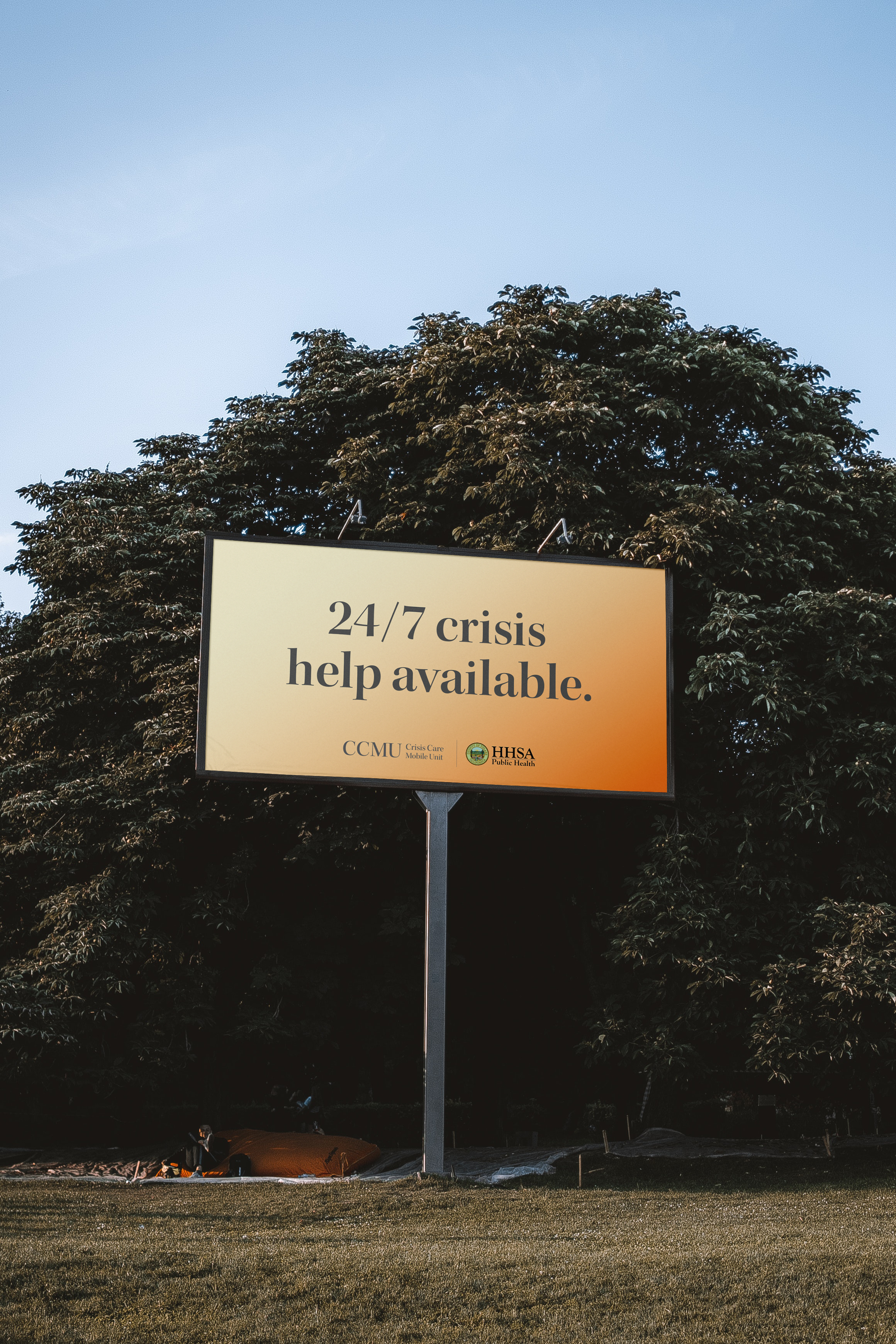
With the County open to moving beyond the existing CCMU name, I developed multiple creative directions for the campaign, exploring how naming, messaging, and visual identity could make crisis resources feel more approachable and meaningful to the people they were intended to reach.
The Challenge - Communicating During a Crisis
Research into existing crisis resources revealed a common challenge: many rely on loud colors, urgent messaging, and visually intense design to capture attention. For someone already experiencing anxiety, suicidal thoughts, or another behavioral health crisis, that approach can add to an already overwhelming moment.
The challenge was to create outreach that could capture attention while still feeling thoughtful, approachable, and appropriate for the people it was designed to reach.
02 / CREATIVE EXPLORATION
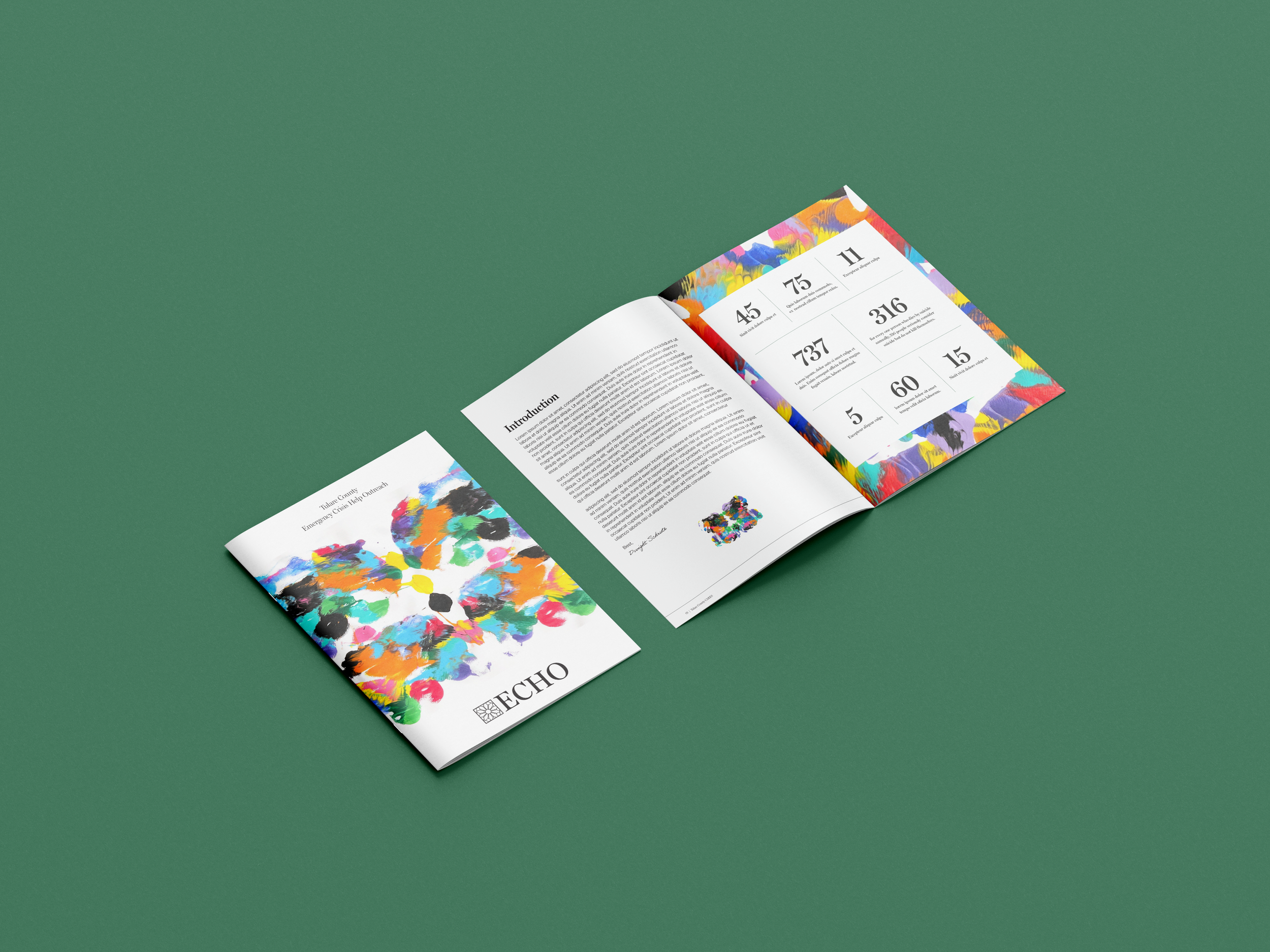
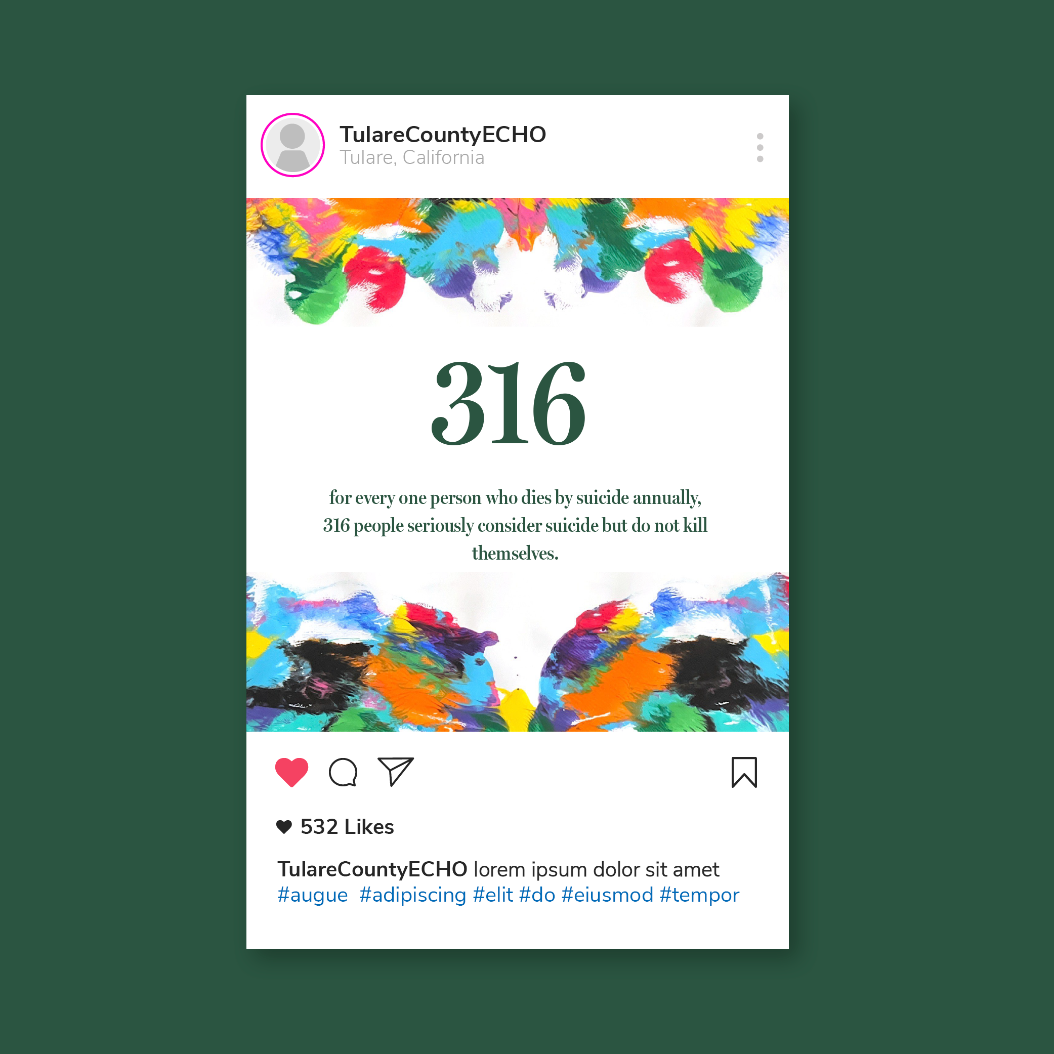
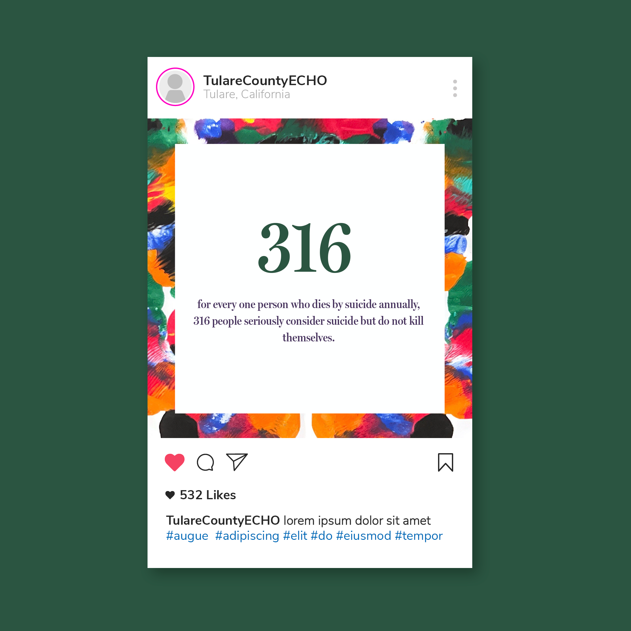
I developed two distinct concepts that approached the challenge from different perspectives. Each included its own name, acronym, visual identity, messaging direction, and applications across social media, video, and print.
CONCEPT 01 / CARES (Crisis Assistance and Rapid Emergency Support)
A Calmer Approach
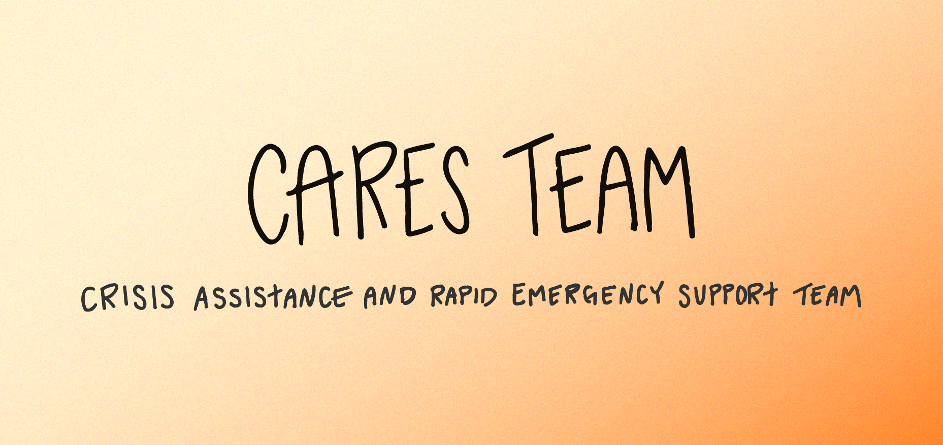
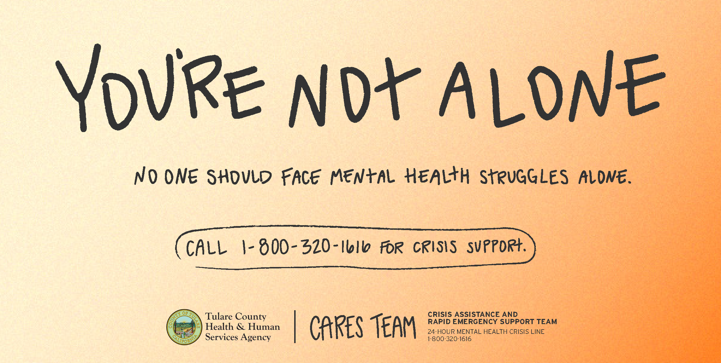
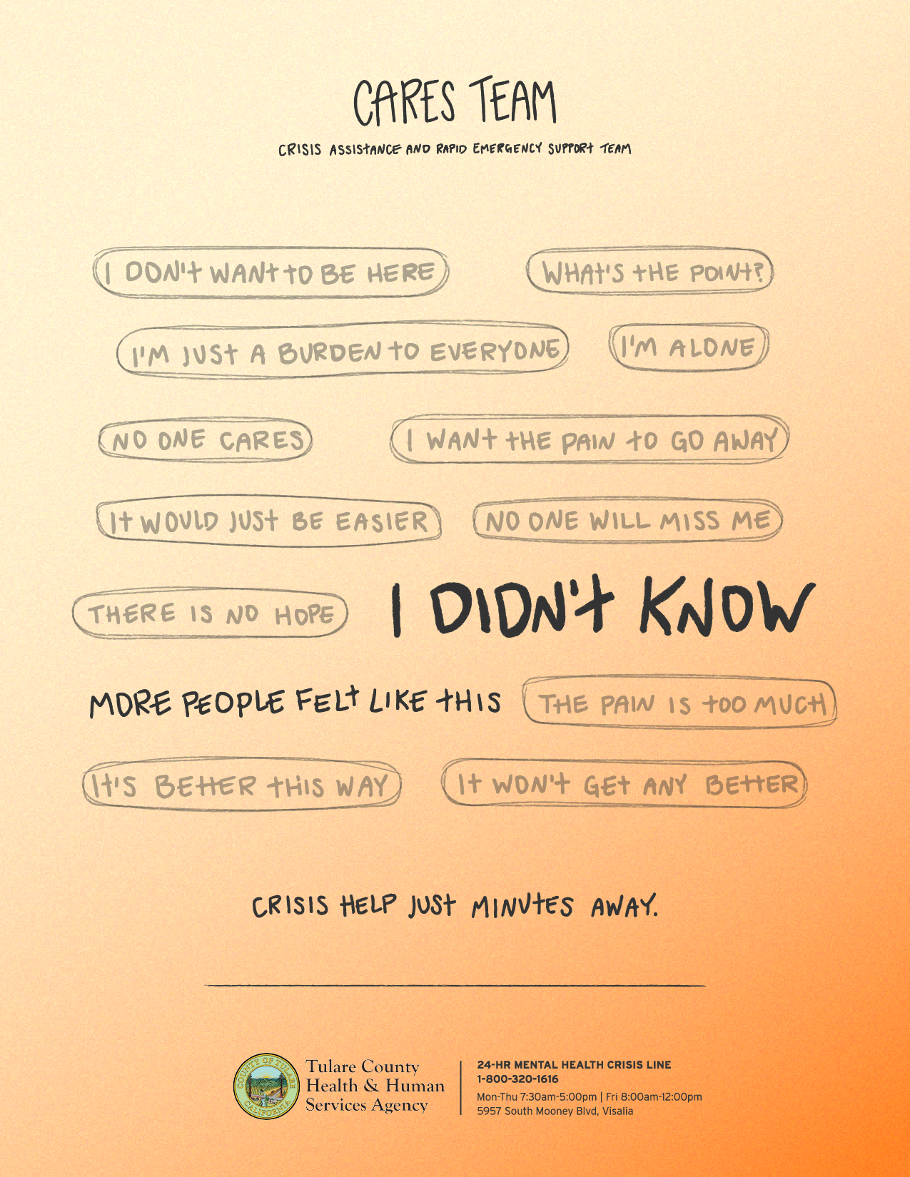
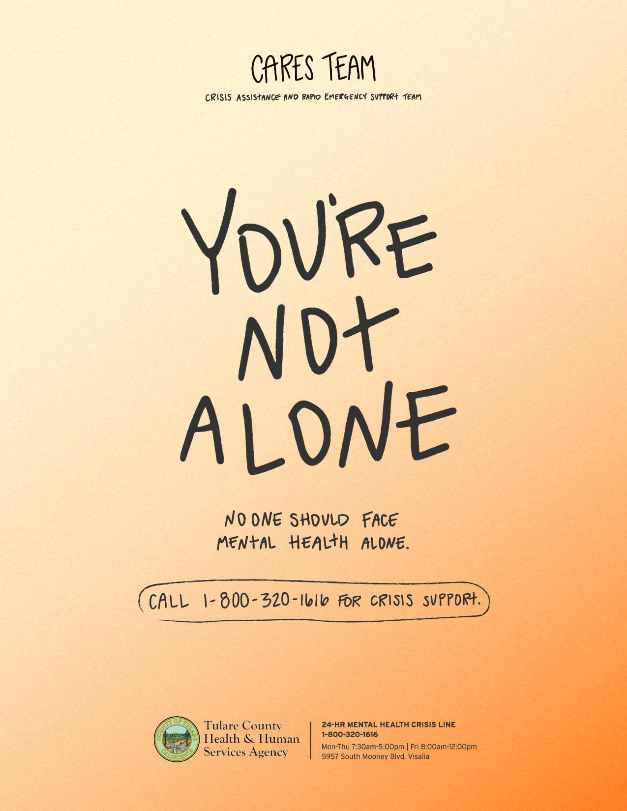
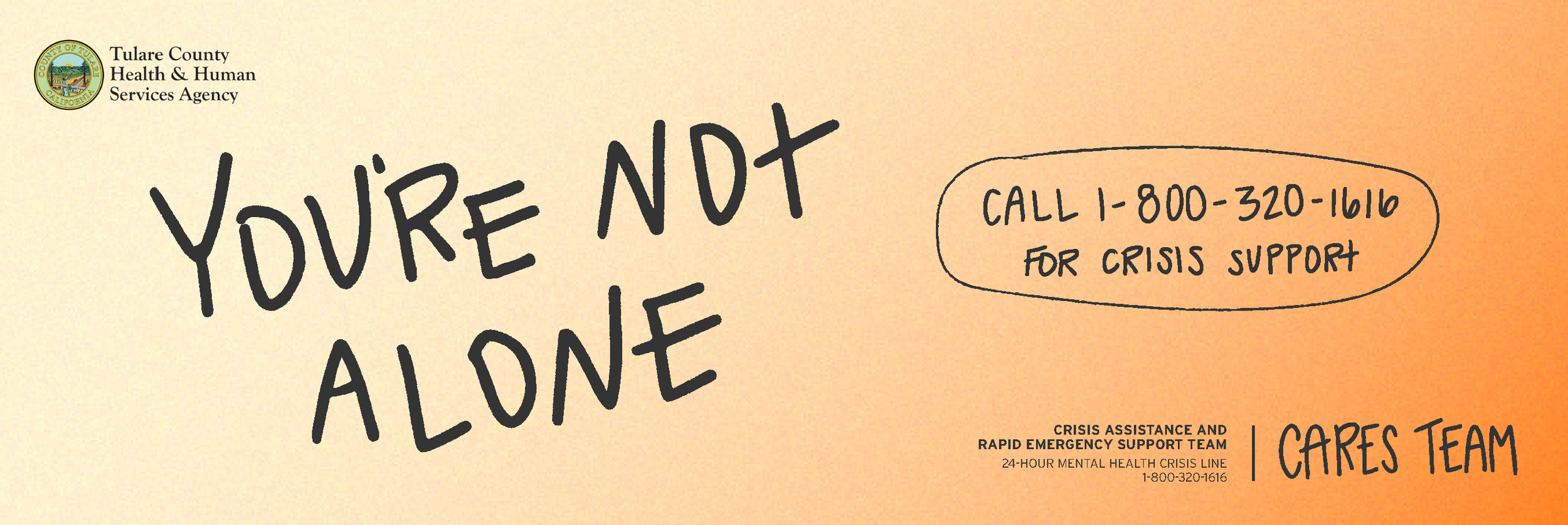
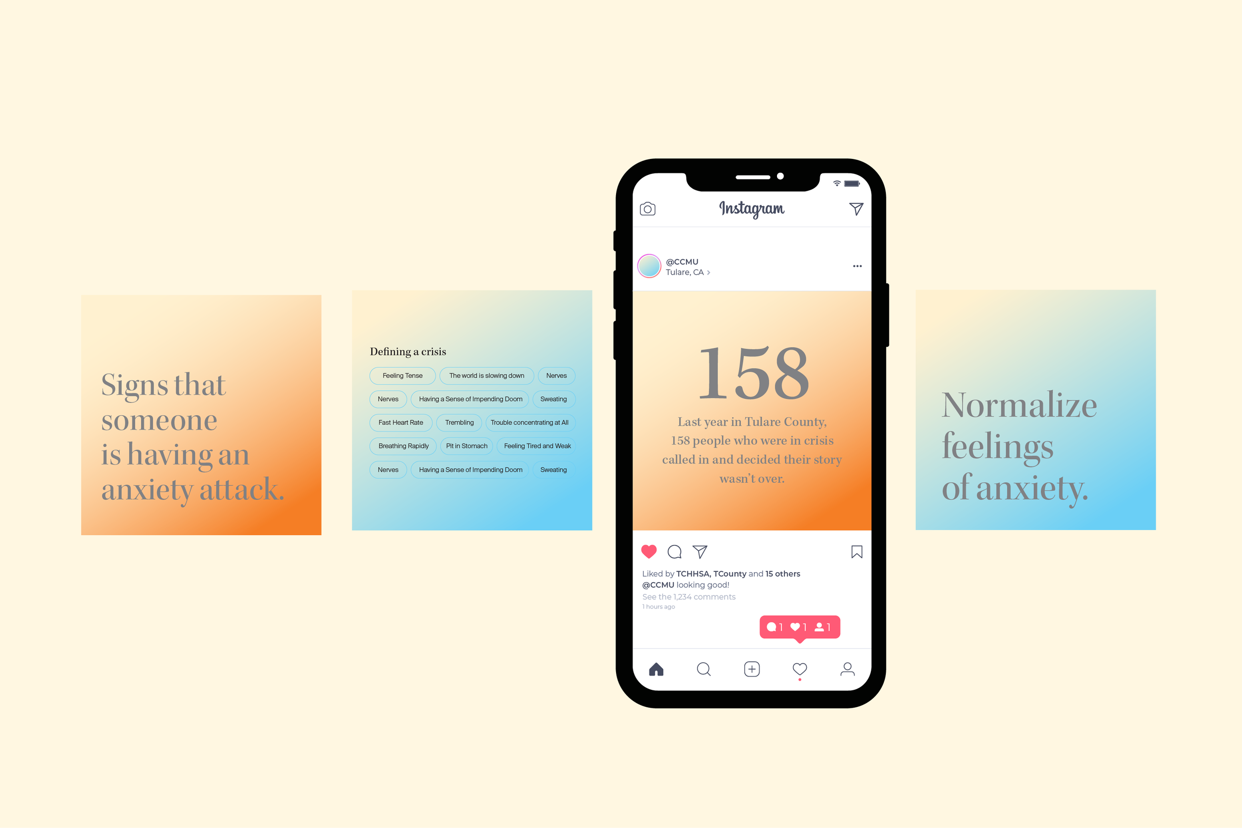
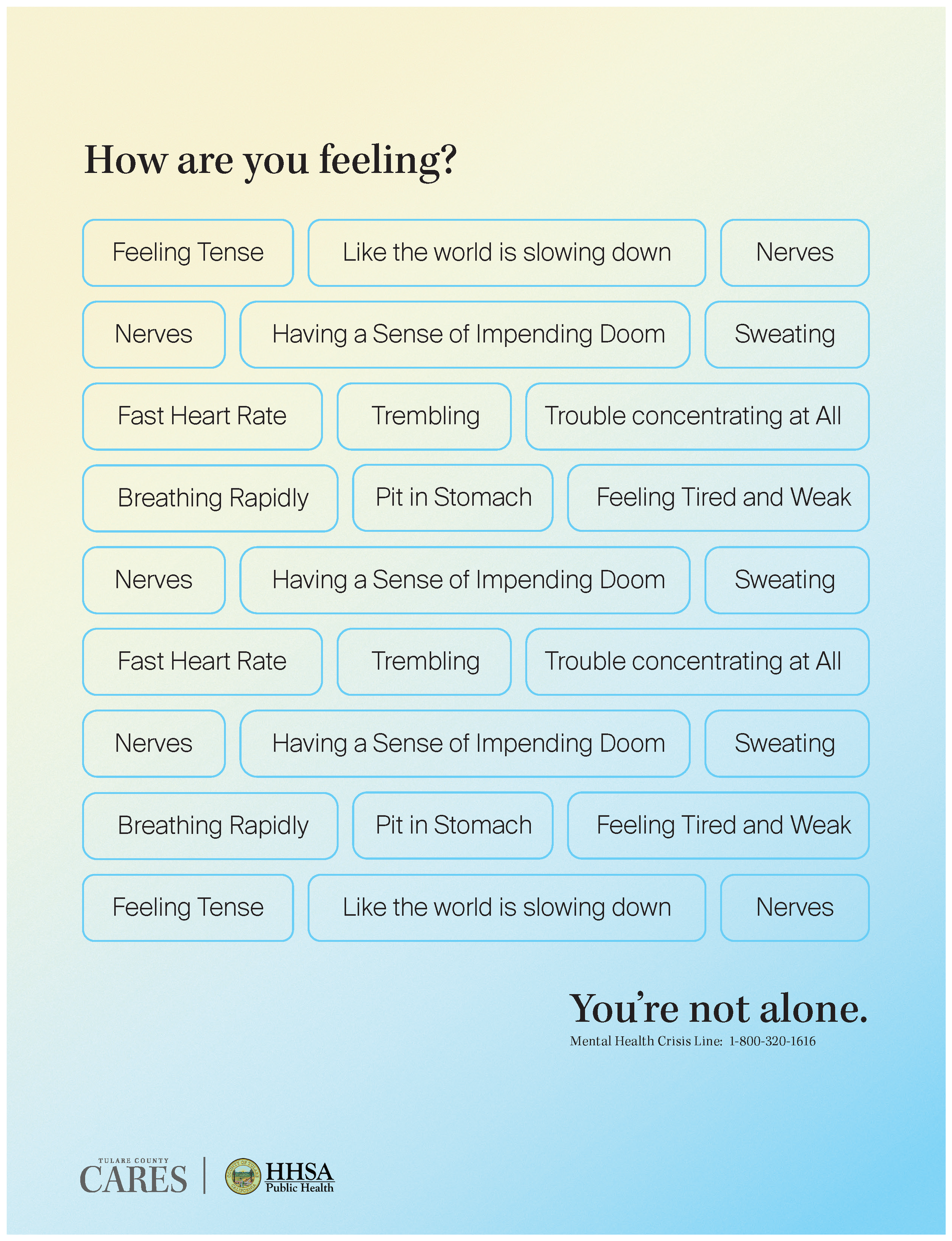
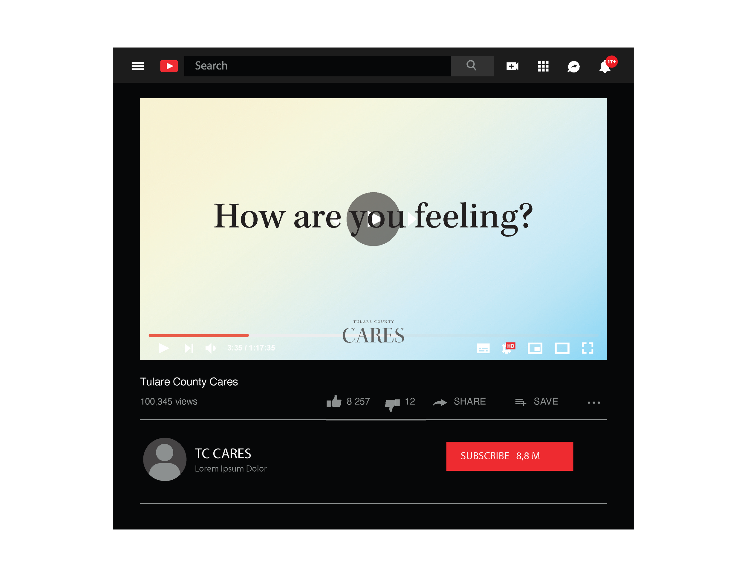
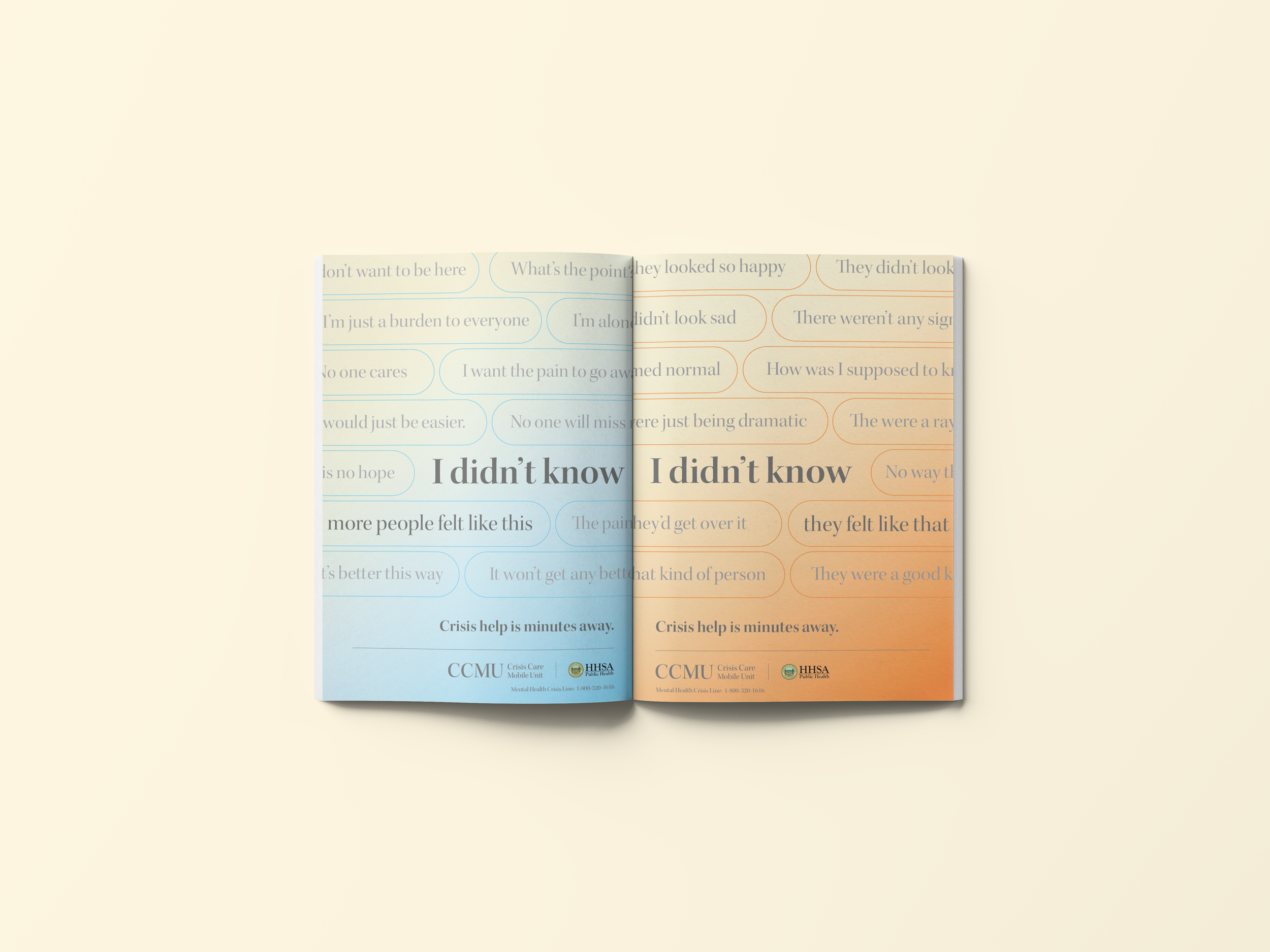
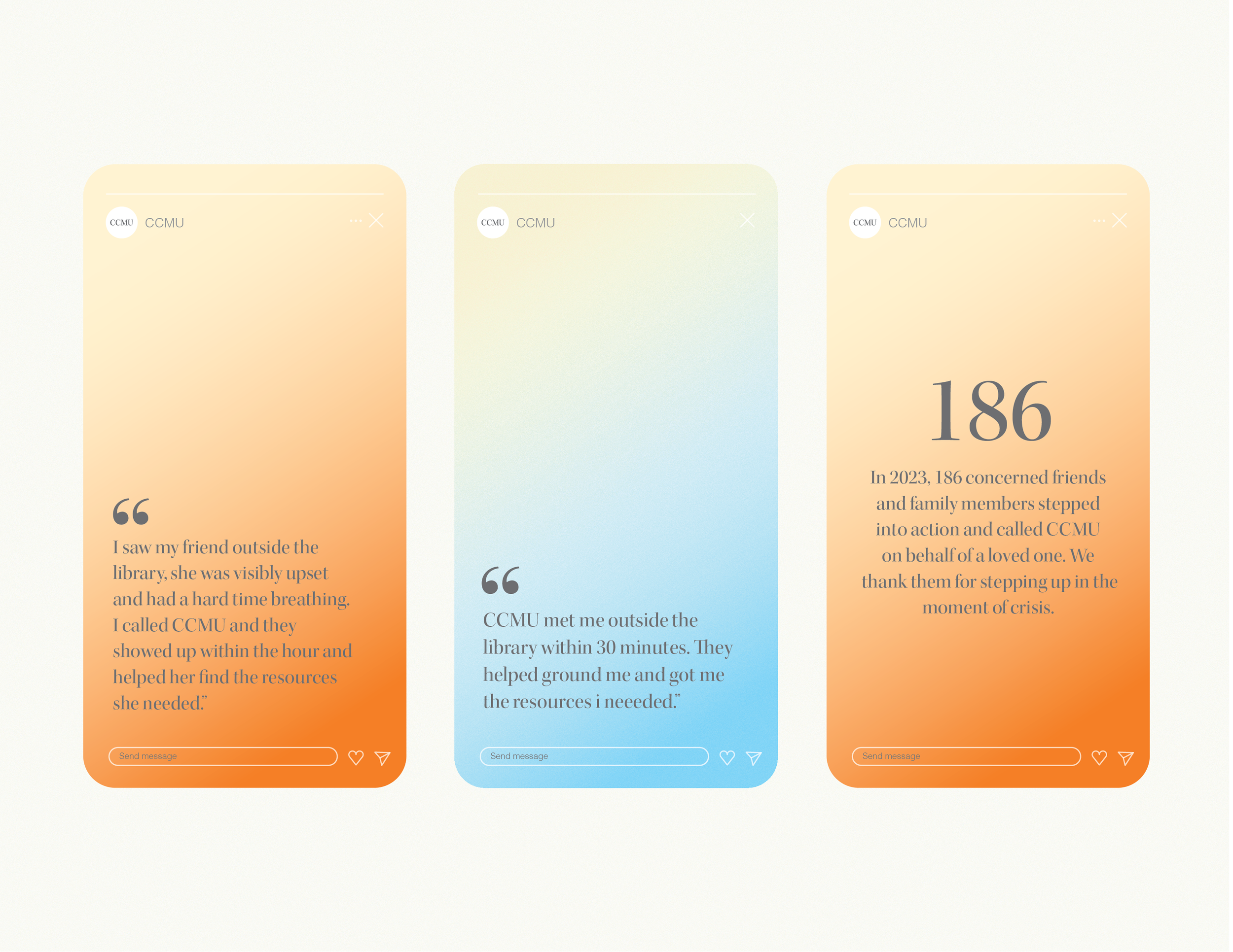
CARES was developed as the softer of the two directions. I created the name and acronym around the idea of support and paired it with calming gradients, restrained typography, and generous space to create a visual system that felt reassuring rather than demanding.
Messaging focused on helping people recognize and put words to what they might be experiencing. The “How are you feeling?” concept uses descriptions associated with anxiety, suicidal thoughts, and other experiences to help someone identify their feelings while reinforcing that they are not alone and support is available.
CONCEPT 02 / ECHO (Emergency Crisis Help Outreach)
A More Expressive Approach
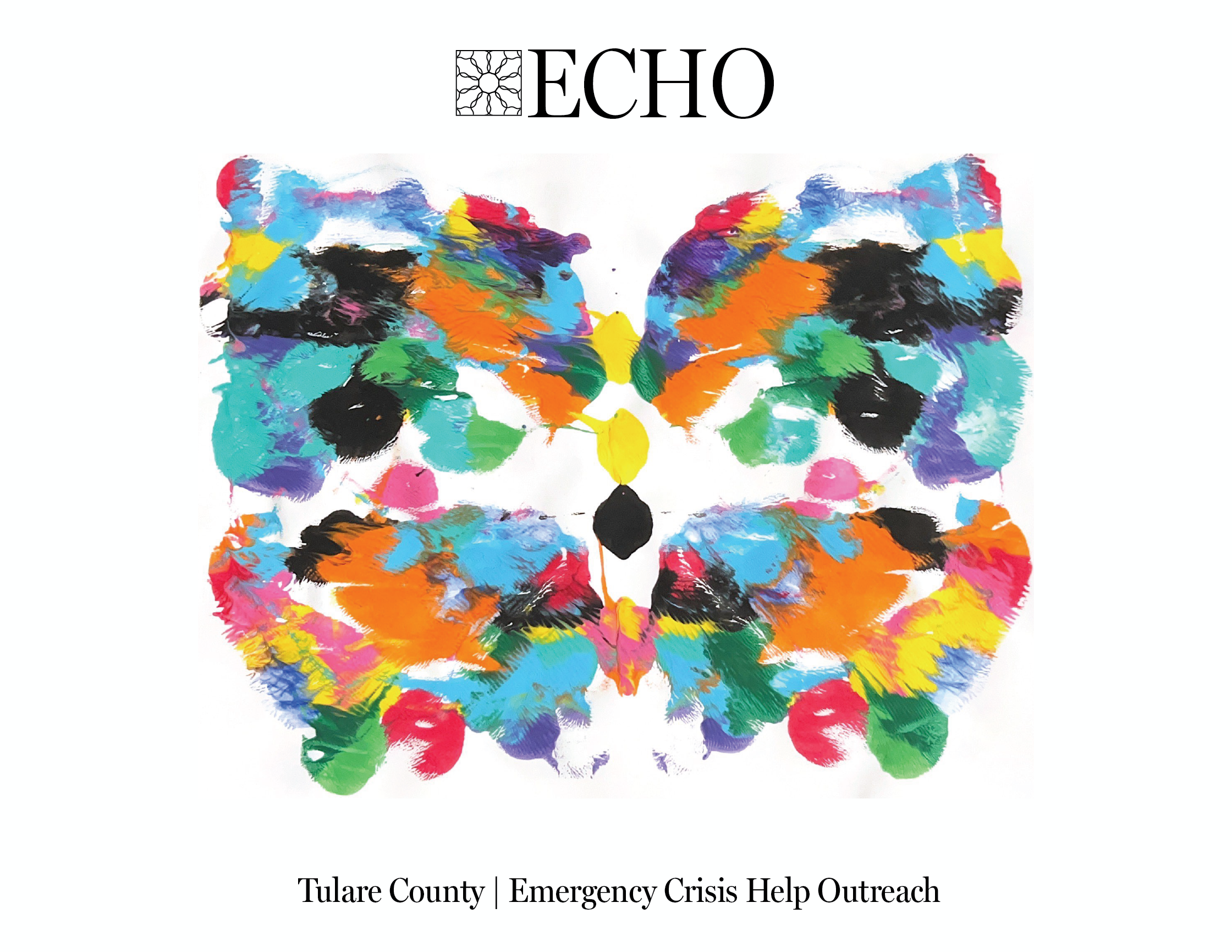
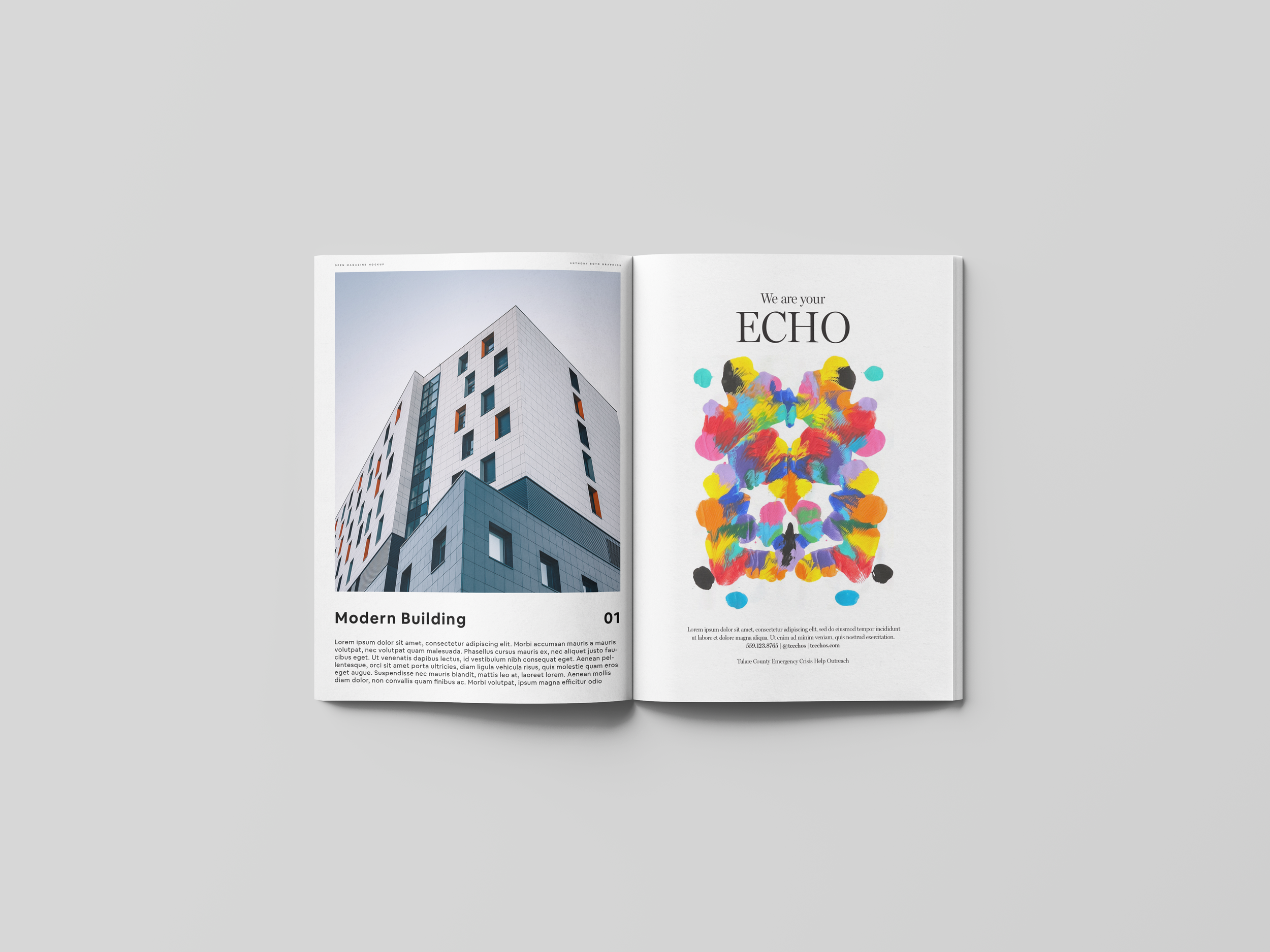
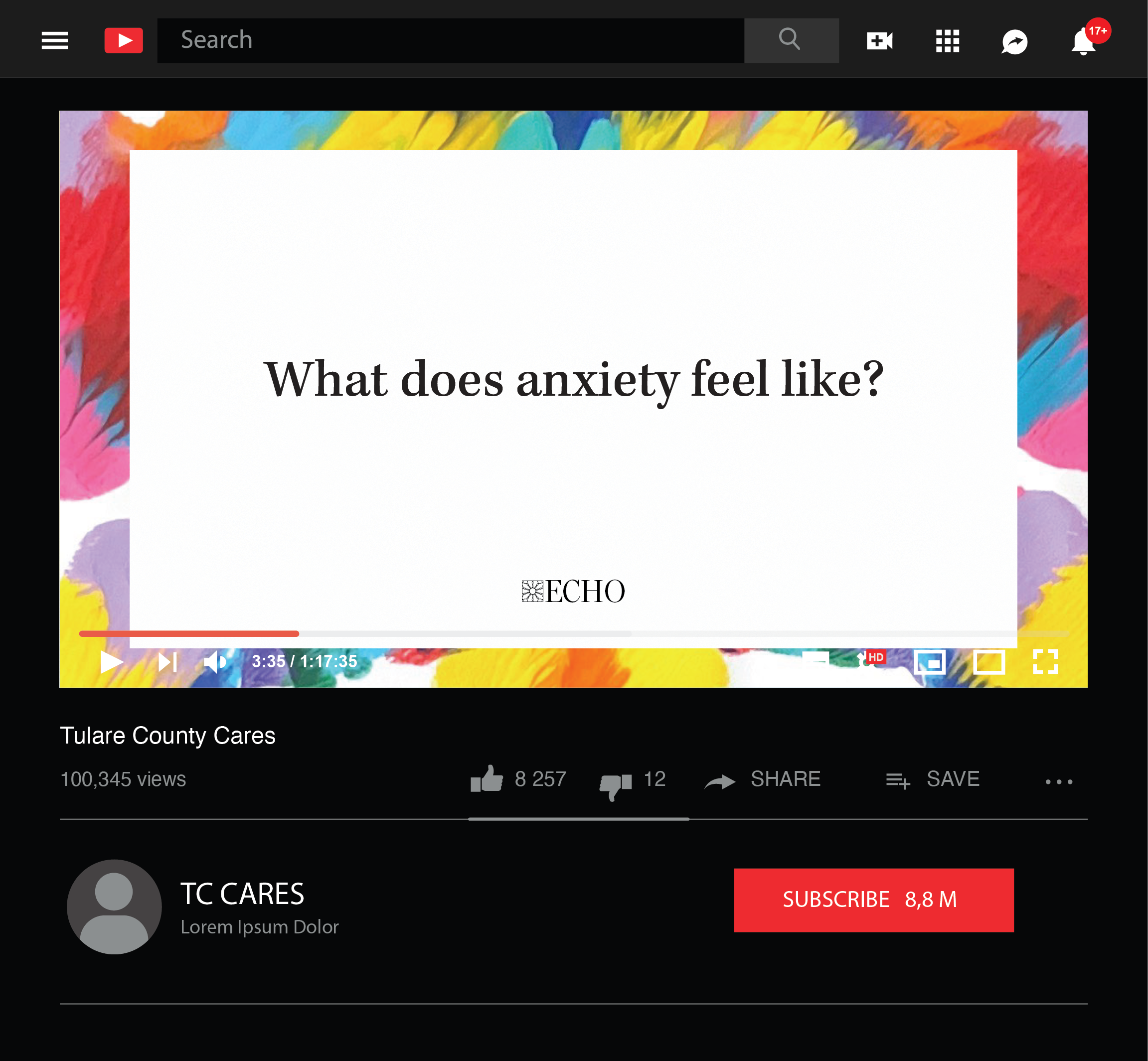
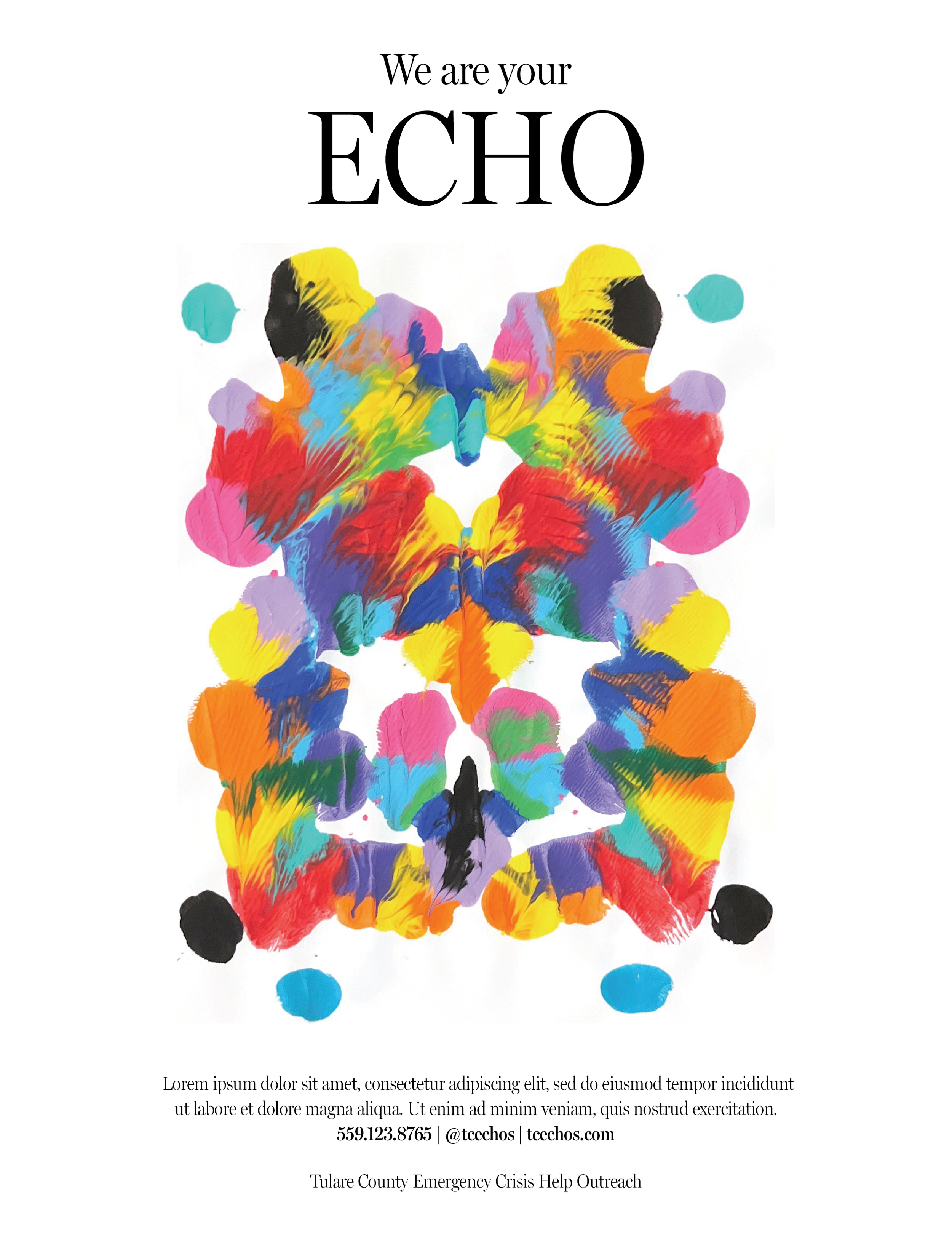
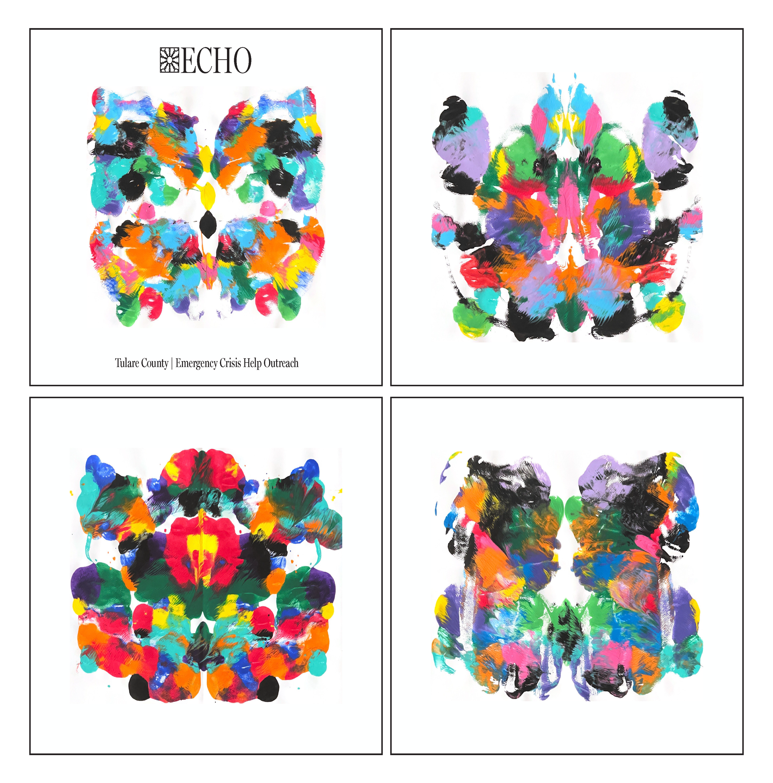
ECHO explored a more expressive response to the same challenge. I developed the name and acronym along with a visual identity centered around colorful, hand-painted forms inspired by the Rorschach Inkblot Test.
The abstract imagery created a connection to behavioral health while giving viewers a visual focal point they could pause on and interpret. The use of color allowed the campaign to feel expressive and noticeable without relying on the aggressive visual language often associated with crisis communications.
FINAL CAMPAIGN
From Concept to Campaign
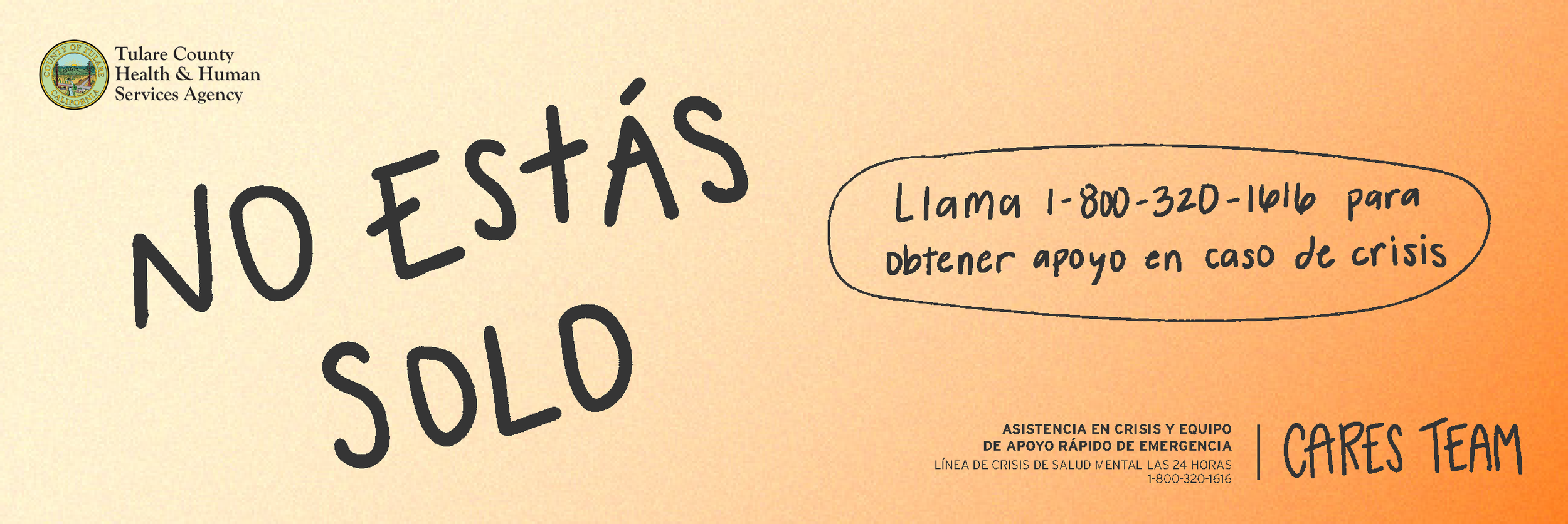
The CARES direction was selected as the foundation for the final campaign, carrying forward the name, acronym, and calming gradient system developed during the initial concept phase.
As the campaign evolved, the visual identity was further refined collaboratively, including the introduction of a custom hand-drawn typeface created by another designer on the team. The more personal typography paired with the soft color palette helped the final campaign feel human and approachable while maintaining the calm, supportive tone established in the original concept.